You are currently browsing the tag archive for the ‘print’ tag.
Well, things are going alright over here in Chicago. I’m working my butt off getting this equipment sold, and getting things in an organized manner about the shop area. I keep uncovering more and more and more STUFF.
Along with so much printing equipment I could be set for decades, I find lots of trinkets and things laying around. They are stuffed in drawers, under boxes and tucked in corners. This is one of the best finds this week:

Gas Mask!
That’s the kind of thing you find in a Veteran POW’s basement! I also uncovered a whole other galley rack, but it was too dark for pictures, and he hates when I take too many pictures.
Today, we moved an ELrod Slug caster, 4 empty Ludlow mats cabinets, a standing stitcher, a Ludlow Supersurfacer, and we did it all by ourselves. Well, we had a truck with a lift gate, some skids and a come-along. So that helped. But it was still hard work. I’m filthy too. I suppose I should go shower. I can’t think straight enough to make this post any more interesting anyway.

Calling Card
After the proprietor’s card I made didn’t meet my standards of quality, (too bad I printed up 700 of them…), I decided to make a new business card in actual business card size. Opting for more of a calling card style, I printed up these simple and elegant business cards. I hope these convey a more relaxed and social message, like “Hey drop me a line anytime!” because I like being friendly.
The ink is a light grey with some silver metallic powder in, just for kicks. I used vintage coated linen finish black paper with a deckled edge.
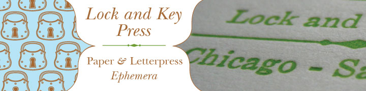
The LKP monogram is made with Hollywood Initials, a new old stock in the box lead font. The other lead type is Franklin Gothic and an unidentified serif. Garamond I think.
I carry these around in my wallet, and when they are gone, i might even make more, because I do like them very much.
Oh by the by, that cute little easel? Its a fork. Yep. A fork, made by the talented Mister of Courtney Hyper the brains (and beauty) behind Hypercraftive. Check out her stuff on Etsy too!!!

Dragon Girl Note Cards
I LOVE these cards. This Dragon Girl is so adorable! Look at her cute little feet, and her innocent smile. Plus, she’s got a dragon! Hanging on to him like he’s a plushie, and he wraps his tail around her so gently and lovingly. Yeah I REALLY love these cards!
The cut these cards are printed from is unique and antique. I found it in a box of old printing cuts I acquired. The really cool thing, is that it is 2 pieces that are not original to each other. The dragon girl is a professionally made magnesium cut from the 1940s. During its life someone decided that she needed to be a 2 color cut and then HAND CARVED into a wooden block the sections of blue for the dragon’s body. The juxtaposition of the two cuts is so interesting.

Dragon Girl Cuts
Printed on vintage coated yellow card stock in purple and teal with 4 white envelopes. Available on Etsy!
Another set of note cards available on Etsy!

Get off my lawn! Damn Kids.
Printed in crazy circus colors of blue and orange on vintage bright green paper, a maniacal clown bursts out of a paper ring and lets you know he doesn’t appreciate you stepping off the sidewalk…
The clown image was printed from an antique copper printer’s cut, or block. I thought it was just a clown until I pulled a test print and he was all screaming and pointing and… OLD. Weird.
Cards come in a set of four with 4 blue envelopes. Colophon has another creepy clown on the back of the card.

Scary Baby Clown
Now available for sale on Etsy.

Happiness
Happiness Note Cards. Hand letterpressed using antique lead type and a Victorian woodcut. Soon to be the last prints of the cut, as it is very old and delicate and won’t stand up to being printed for much longer.

Happiness Detail
Set of four cards, blank inside, single fold with plain white envelopes.
A great birthday card, “I Love You” card, wedding congratulations or Baby Announcement! So many things bring us happiness, and this card can express it beautifully.

Happiness Colophon
NOTE: I’m a dumb ass and my boyfriend just informed me i’ve been mixing my metaphors. Like booze and sleeping pills, it could be dangerous. The title of this post was supposed to refer to the phrase “Wet behind the ears” but I confused the saying with someone being “green” as in “new and young to something”. So alas a new phrase, “green behind the ears” is born meaning: to have not yet participated in one’s first ecologically conscious craft show…

My set-up

Left End

Right End
The crowds were alright for the show. I don’t really know too much about what to expect this time of year, during that weather etc etc in regards to turn-out of attendees, but its seemed like there was a good flow of people.
I am a little disappointed in the amount of sales and such though. I’m pretty sure its not my fault (I Am good enough, people like me!), as a few other vendors where wondering where all the sales were too. But, really, I suppose we should have expected it in this economy…
One thing that really killed my sales was my table location. See, I picked a nice corner spot, thinking that I’d be right by the doors where everyone came in. I guess The Powers That Be decided those doors were Emergency Exits only, so instead the main entrance was at the exact opposite corner, putting my table at the end of the very last row. Unforeseen switch-a-roo there… BAH and FIE!
The other things that I hesitate to complain about because they were pretty awesome, were the Fashion Show, and the Bands. The Fashion Show went on for almost 2 hours, and while it was very cool and participants got their work show cased, it literally blocked off an entire aisle of vendors from any traffic at the busiest time of the day.
The last thing I’m going to have to keep an eye out for at other shows, is : Do Not choose a spot directly in front of the band stand. While I had a front row seat for several great acts including Raw Earth and Red Card Royale, it was hard to converse with customers, and I think a lot of shoppers avoided that corner because of how loud it was. Also, there were belly dancers that accompanied Raw Earth. They were EXCELLENT. I loved it! (One gorgeous woman even asked me to dance with her but I was so intimidated I couldn’t. She was too beautiful and I was unworthy…) But anyway, awesome as they were, it created a bottle neck in front of my table. Lots of people hovered to watch the dancers, but no one wanted to walk in the narrow space between us end cap vendors and the dancers.

Belly Dancers
I’ll hand in these observations as notes for next years Green with Indie.
All in all, for this show being the first show in the area of its kind to focus on sustainable goods, up-cycled art and craft items and be billed as a No Waste Event, it was a complete success! April Tate of Miss Lemon fame of the STLCM did an amazing job organizing the whole thing and booking the entertainment. (I don’t know when that woman sleeps.)
Webster U was gracious and we had no problems that I know of with the event being held in the gymnasium. Hooray! They’ll let us back next year?
I also got to meet some pretty kick ass fellow Craft Mafioso, like David from Cranky Yellow, Kate of Red Anvil Art (she traded me a necklace!!!), Katie from Scarlet Garnet, and Shelah of Destroyed by Design.
I met some other great crafters (and colleagues I hope) like Sparrow Studios, Chef Jeff, Secret Leaves Paper Works and lots of others who are linked on this page.
Next big shows coming up are the Big Ass Indie Art and Craft Show July 31 – August 2, and the Cherokee Street Cinco de Mayo Art Fair. Also, check out some of Lock and Key’s printed Ephemera for Sale at Cranky Yellow, on Cherokee Street at Nebraska in Saint Louis Missouri.
Admit it. You like a steamy romance novel now and then. Fabio the Pirate rescues Evaletta, the Mermaid Princess and makes sweet sweet underwater love until Evaletta’s evil Mer-king father finds out and – well, you know how it goes. But I bet you wouldn’t be caught dead reading that novel in a coffee shop. no no. Coffee shops are where you bring your Kafka and your Pynchon to advertise to the world how cultured and well read you are. But you really want to find out if Evalette lives through that avalanche, without the scrutiny of your caffeinated peers.

They look great on the shelf
Enter the BOOK COVER!!! Yes, you can wrap your romance novel, your biography of Richard Simmons, or The History of Paper Clips in an air of secrecy while you sip your latte. Give people a clue about what tome you peruse by using the labels appropriately, or just put on the brown cover labeled BOOK and keep them guessing.
Borrow books a lot? Friends tired of you forgetting you have their copy of Pride and Prejudice? Wrap your on-loan volumes in a BORROWED cover so you don’t forget to whom the must return! You can even write on the cover to keep a record of who you borrowed from and when! COOL!

Keep them organized
These covers are highly functional! They keep the original dust cover from being ripped, torn and otherwise abused in your purse/knitting bag/back pocket, while at the same time preserving the cover of the book whether it be hardcover or paper back! A few simple folds and VIOLA! force-field of protection around that copy of Why Cats Paint!

Superior protection against nicks and dings
The Cream colored set is letterpress printed from vintage wood type, hand-inked in blue, brown and orange for a unique marbled texture, and set includes 4 covers, one each of FANTASY, MYSTERY (not pictured), BORROWED, and FAVORITE.
The Green set is 2 covers, FICTION and NON_FICTION printed from wood type in brown on textured green paper.
And not in a set, but sold individually, is a brown textured linen finish paper stock printed simply with the word “BOOK” along the spine. Durable and reuseable!
But if you want them you’ll have to come by the Green with Indie craft show next weekend. They are sure to go fast, so shop early and often!
The book plates are done. Have been for some time, but I’m lazy and sometimes the internet is a jerk. Here they are in their purposed application:

Modern Bookplates

Typographic bookplates
On the Press Now are some three color bookplates. I was looking over at (Oh so) Beautiful Paper and saw these Harry Potter book covers reimagined by M.S. Corley.


AMAZING! So I grabbed some of my old books down from the shelf, remembering how wonderfully some of my Science Fiction paperback book covers were designed. Then I set to work making these bookplates, that would look so beautiful pasted inside vintage books with Mid century designs.
Typography rules! I’ll post the third color and the complete plates when they are finished.
In order to complete my membership requirements for the Amalgamated Printer’s Association, I had to print up 155 copies of my proprietor’s card. It is like a business card, but in 3×5 format, I assume for the extinct Roladex…
Prop cards have to have your contact info, a bit of press info and exude your image. I’m pretty disappointed in how this card came out.

Prop Card
The type I have is old, and well-used, so finding crisp undamaged characters is difficult. The underline of “Lock and Key Press” is the only one I have, and it is nicked and dinged up in several places. I don’t mind that so much… My pretty pretty shadow font is so beat up, I can’t set more then five letters without one of them having a big old gash in it. Such is the nature of these utilitarian antiques, though.
I’m also disappointed in my lack of typographic skill here… I’m a great typographer, good with layout and have an eye for figure ground relationships. This arrangement of type on the left hand side bothers me. Its cramped, and dense. It looked good on proof, so I don’t know why I changed it, and didn’t pay any attention to how awful it looked.

First Proof with mispellings etc.
But this is the 1stgen prop card, and will serve its purpose for now, but I will be redesigning and reprinting the whole thing because I don’t want this to represent me for long. I’d like to actually have my lock logo on the card, similar to my banner here and in my Etsy shop. I should know better than to make something like this. Ugh.


Comments