You are currently browsing the tag archive for the ‘antique lead type’ tag.
In order to complete my membership requirements for the Amalgamated Printer’s Association, I had to print up 155 copies of my proprietor’s card. It is like a business card, but in 3×5 format, I assume for the extinct Roladex…
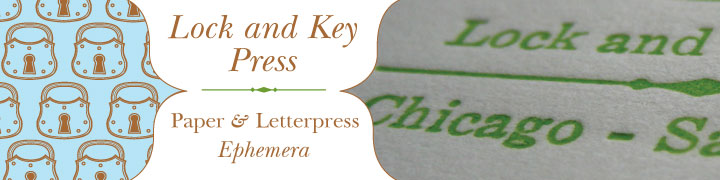
Prop cards have to have your contact info, a bit of press info and exude your image. I’m pretty disappointed in how this card came out.

Prop Card
The type I have is old, and well-used, so finding crisp undamaged characters is difficult. The underline of “Lock and Key Press” is the only one I have, and it is nicked and dinged up in several places. I don’t mind that so much… My pretty pretty shadow font is so beat up, I can’t set more then five letters without one of them having a big old gash in it. Such is the nature of these utilitarian antiques, though.
I’m also disappointed in my lack of typographic skill here… I’m a great typographer, good with layout and have an eye for figure ground relationships. This arrangement of type on the left hand side bothers me. Its cramped, and dense. It looked good on proof, so I don’t know why I changed it, and didn’t pay any attention to how awful it looked.

First Proof with mispellings etc.
But this is the 1stgen prop card, and will serve its purpose for now, but I will be redesigning and reprinting the whole thing because I don’t want this to represent me for long. I’d like to actually have my lock logo on the card, similar to my banner here and in my Etsy shop. I should know better than to make something like this. Ugh.


Comments